August 2005
August 31, 2005 05:09 PM
I lived for ten years in New Orleans and on the Gulf Coast, and my heart goes out to the residents of those areas.
If you want to help, please donate money. I know I will.
Also see Wikipedia's entry on Katrina.
-mh
Posted in Not broken
| Permalink
| Comments (41)
 Jason Hite points out this baffling Internet Explorer message.
Posted in Web/Tech
| Permalink
| Comments (35)
August 30, 2005 12:03 AM
 Echoing our recent post on hotel room alarm clocks, Alex B. sends in this gem. He writes:
The buttons needed to change the time are nowhere near the actual 'clock' part of this device - instead they are up near the CD-related controls.
Posted in Product Design
| Permalink
| Comments (34)
August 29, 2005 12:58 PM
 If you need a sign...
Posted in Signs
| Permalink
| Comments (27)
 Adam Gostenik asks, "Is it just me, or does something seem wrong with this photo? I didn't realize that NASA used duct tape to fix stuff."
The MSNBC photo (photo 15 here) has the caption:
Workers take a look at the newly installed liquid hydrogen bellows heater on Discovery's external tank.
Posted in Product Design
| Permalink
| Comments (22)
August 27, 2005 10:06 AM
Ai, the domain problems of the last 24 hours. I'll spare you the long story.
But here's my question, all I need to fix the problem: if you're a TypePad user, could you e-mail me (mark@goodexperience.com)?
Here's the question:
In TypePad->Configure, Weblog Basics -> Weblog folder name has the folder name as "/b".
It won't let me remove the /b (?!) - it says I "can't delete the folder name" ... so, *all* the links, image links, everything - all broken on the site because of that b.
Question: can I remove the "/b"? It wasn't there before and I don't know how it got there, and I can't remove it for some reason. Can anyone help?
Posted in Web/Tech
| Permalink
| Comments (7)
 Guy Mann points out this page on the BestBuy.com website, which lists products in a menu:
Linksys W...
Linksys W...
Linksys W...
Linksys W...
Posted in Web/Tech
| Permalink
| Comments (22)
August 26, 2005 12:03 AM
 Kenton Varda writes:
While not nearly as broken as the Hummer nav system discussed previously, the navigation system on my brand-new Toyota Prius is not without its quirks. Here we see a picture of the destination selection page.
If the car is moving, all buttons except "emergency" are disabled, preventing you from entering a destination. Presumably this is to deter stupid drivers from trying to type while driving. However, more often it simply prevents an otherwise unoccupied passenger from working the nav system.
The car computer is perfectly capable of detecting the presence of a passenger, as demonstrated by the passenger-side seat belt light. Why can't it leave the controls enabled if someone is sitting there?
Posted in Product Design
| Permalink
| Comments (32)
August 25, 2005 12:03 AM

 Andrew Lyons writes:
A spa called Athena (after the ancient Greek godess) is opening near where I work. It has an odd banner. I think the designer was told to "put a picture of a statue on it". The problem is, they used a statue of Queen Victoria. To my knowlege she wasn't Greek (or ancient enough).
Posted in Advertising
| Permalink
| Comments (16)
August 24, 2005 12:03 AM
 Andrew Woods sends us this phonecame pic and writes:
Found this in the cafe of my university engineering department. Seems that those thermal dynamics lectures didn't go to waste!
Posted in Signs
| Permalink
| Comments (21)
August 23, 2005 12:03 AM
 Brian Weaver writes:
I have used Krylon products for years, especially their fixative products and more recently their spray paints. The product while excellent has a major package design flaw.
The new lid design is supposed to make opening the spray can easy, however the positioning of the indentations creates a pinch effect on the lid making a firm grip almost impossible, and as you pinch and pull according to the instructions your fingers of course slip off, sometimes painfully.
Posted in Product Design
| Permalink
| Comments (14)
August 22, 2005 12:03 AM
 Bryan writes:
Found this emergency exit sign on the inside of the door of in my Ramayana Hotel room in Bali recently. So far so good. However, note the use of inappropriate, indeed counter-intuitive, coloring, i.e red for where to run and green for where not to run (or stay) in case of a fire.
Also, it seems to me that the "U are here" hint has no bearing at all on the sign, much less on the location of my room.
Finally, coloring the arrows to note the path to follow would have helped a lot, as you now have to look quite carefully to discern them.
Altogether quite tricky to find your way out under normal circumstances, let alone when there's a fire raging and smoke is billowing all over the place.
Posted in Signs
| Permalink
| Comments (42)
August 20, 2005 12:25 AM
Michael Heinrichs points out that Rogers' instructions are out of order on this page. (Step 2 has to come before Step 1!)
Posted in Web/Tech
| Permalink
| Comments (28)
August 19, 2005 12:01 PM
Customer service horror stories in this Chicago Tribune article.
Posted in Customer Service
| Permalink
| Comments (28)
 Howard Meyer writes:
It looks like the lady has fat arms, but really she's sitting in a chair.
Posted in Advertising
| Permalink
| Comments (18)
August 18, 2005 06:54 AM
 Adam Gillitt points out this poor ad placement on CNN.com - selling the same steroids that Rafael Palmeiro got busted for using.
(Thanks to Steve Hoffmann for a similar submission.)
Posted in Advertising
| Permalink
| Comments (22)
 Branden Gunn writes:
Spent a week in Wichita for work, and was continually annoyed by the obvious lack of usability designed into the toilet paper holders. I'm flexible, but this was just beyond my normal range of motion. I kept putting one roll on the sink so I could reach it. Of course, the cleaning crew always put it back where it belonged. This picture was taken on my last day at the Radisson Broadview, in Wichita, Kansas.
Posted in Place
| Permalink
| Comments (27)
August 17, 2005 12:03 AM
 Jeremy Arling writes:
This is a page for the online application to the DC Bar. I find it ironic, given that it is the ethics section of the form.
Posted in Current Affairs
| Permalink
| Comments (10)
August 16, 2005 05:15 PM
From the NYT today: In the Hospital, a Degrading Shift From Person to Patient.
(Thanks, Laura)
Posted in Current Affairs
| Permalink
| Comments (19)

 Ben Schumin points out that even "Fresh Food!" can be problematic. (From a Sheetz in Fishersville, Virginia.)
Posted in Web/Tech
| Permalink
| Comments (29)
Posted in Travel
| Permalink
| Comments (16)
 Greg Turner writes:
I went to Sydney Olympic Park, along with 70,000 other people, to see the opening event of the Sydney Festival. Upon returning to the train station, we were all confused by the signs directing us. 4 passageways had a large "no entry" sign, and one passage (the green to the left of the photo) had an "Entry" sign. Two of the "No Entry" passages had a green arrow underneath, which meant, apparently, that we could in fact enter after all. A good thing too, as squeezing that number of people through only 20% of the available bandwidth would have been even more chaotic.
Posted in Signs
| Permalink
| Comments (8)
August 13, 2005 12:08 AM
 Dan Thomas points out this contradiction on the Dell website.
(The page in question is here.)
Posted in Web/Tech
| Permalink
| Comments (32)
August 12, 2005 12:08 AM
 An anonymous reader writes:
If the product isn't broken, it soon will be if you try to follow the instructions from this scooter manual... this is just one page from it. For example, I'm not sure exactly what "Ress the Humper" means.
[And "Whole Body Fold Situation!" -mh]
Posted in Misc
| Permalink
| Comments (29)
August 11, 2005 12:03 AM
 I spotted this sign earlier this summer: a seafood restaurant named "Yesterday's".
I can just imagine.. "Well, honey, what do you feel like eating tonight?" "How about some of Yesterday's seafood?" "Mmmmmmmmm!"
Posted in Food and Drink
| Permalink
| Comments (18)
August 10, 2005 01:31 PM
John F. writes:
Given the budget problems all public transit systems seem to be having around the country, it's interesting that Washington, DC would not fix the Metro, which doesn't adequately help the millions of tourists who visit every year. I could see ignoring this kind of stuff at the far-flung stations at the ends of the lines mostly used by commuters, but not down by the Mall/White House/Downtown area.
Link: Welcome to Washington, And Now You're on Your Own
Posted in Travel
| Permalink
| Comments (32)
 Matt Wilkie points us to this HP Support page that describes how to read the error codes on an HP printer:
System error codes consist of four digits that explain which component or system is failing and what action should be taken to correct the problem. The front panel of the printer can only display graphics, so the system error codes are represented as bars. Determine the error code by counting the bars on the front panel display...
Matt concludes:
This is in sharp contrast of the designjets of a few years ago whose front panels, which can only display text, give very hard to understand messages like "paper misaligned", "ready to load paper", "cyan ink low", "paper jam" and so on. Now that we have graphics, it's so much better.
I griped to HP technical support about this. Their response was that they moved to pure iconography in order to better support their international clients, many of whom do not read english. Yup, it's much easier to read the internationalised verison of http://tinyurl.com/4jdys than it is to look up "paper jam" in a translation dictionary. Or spend the extra time and money to code multingual error messages into the onboard computer. Or dispense with words altogether and use pure numerical error codes. I mean mongolian numbers are so different from english ones right? (Sarcasm...)
Posted in Web/Tech
| Permalink
| Comments (21)
August 9, 2005 12:03 AM
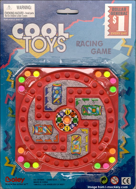
 Seth Nelson points out a new Boley toy with an ill-advised board design.
(from i-mockery.com)
Posted in Product Design
| Permalink
| Comments (45)
August 8, 2005 12:03 AM
 Alex Blanck writes:
My sister recently got this pedometer that comes with a 10,000 step guide to walking. I understand the meaning, but on first glance this could look a little overwhelming.
Posted in Product Design
| Permalink
| Comments (16)
August 6, 2005 12:03 AM
 Greg Sullivan points us to this QuickTime error.
Posted in Web/Tech
| Permalink
| Comments (28)
August 5, 2005 12:03 AM
 Paul Belden writes:
Walden Colorado, "Home of the 1990 Nation's Capitol Christmas Tree", has a population of 870, an elevation of 8,100 feet, and a restroom in the back of its courthouse that questions whether one should be lady-like, or gentlemanly.
Posted in Signs
| Permalink
| Comments (18)
 Alex B. points out this virus error message he saw a few months back at the Houston airport.
Posted in Travel
| Permalink
| Comments (25)
August 4, 2005 10:17 AM
 Michael Beckner points out this photo and adds:
Lemme get this straight: Hennessy, clearly "thinking different", uses Marvin Gaye's image to promote its hooch. Did nobody mention that this icon's life was cut tragically shot when he was shot by his alcoholic father?
Posted in Advertising
| Permalink
| Comments (25)
 Bob Sifniades writes:
I bought this no-name showerhead from Home Depot. It says "Brand New" on the front. I figured maybe it was printed with water-soluble ink that would disappear during the first shower. But several showers later, and it shows no sign of going away. As far as I can tell, it's printed with the same permanent ink as the 3 pictographs, and will be falsely proclaiming its new-ness for a long time.
Posted in Product Design
| Permalink
| Comments (29)
August 3, 2005 11:06 AM
Provocative article on the economics of bottled water. I'm not claiming the high ground, since I buy bottled water a lot for the convenience. But here are the facts:
"Ounce for ounce, it costs more than gasoline, even at today's high gasoline prices; depending on the brand, it costs 250 to 10,000 times more than tap water. Globally, bottled water is now a $46 billion industry."
"Clean water could be provided to everyone on earth for an [extra] outlay of $1.7 billion a year... this is less than a quarter of global annual spending on bottled water."
Posted in Current Affairs
| Permalink
| Comments (28)
It's that time of year again... The Bulwer-Lytton Fiction Contest rewards the worst first lines of (imagined) novels.
Posted in Just for Fun
| Permalink
| Comments (13)
 Raja Raza has a valid point. He writes: "UPS tried to send me a postcard to the same address which, according to them, is not correct...? If the street name is wrong, how will it get to me?"
Posted in Customer Service
| Permalink
| Comments (16)
August 2, 2005 12:02 AM
 Michael McKinley writes:
This was on a GoldStar microwave at a Holiday Inn I was staying at.
Posted in Product Design
| Permalink
| Comments (45)
August 1, 2005 02:21 PM
 Over at Make Poverty History they state their case - in hard-to-read gray-on-white text. C'mon, guys, clarity gets the word out better! If you want someone other than hip designers to read your stuff, stop designing websites with gray-on-white text.
It's just like the unreadable print ad from a few weeks ago.
Posted in Web/Tech
| Permalink
| Comments (31)
 Aaron Feaver writes:
I'm attaching a photo of a package of salmon I found at Trader Joe's in Portland, Oregon. With all the fuss about farm-raised Atlantic salmon vs. wild Pacific salmon, it's funny to see how far companies will go to confuse people. The package reads: Pacific Supreme Smoked Atlantic Salmon.
Posted in Product Design
| Permalink
| Comments (26)

